(This was so emotional to watch) The thing that amazed me about this advertisement for the album is everything. The graphics are amazing, and the way the fonts is so simple yet striking, that really caught my eye. Also, the advert highlighted just some of Michael Jackson many successful and amazing songs, which is key to interest the treated audience (however Michael Jackson didn't have a target audience because his music was loved by all ages, young and old, rich and poor which is amazing) The three main colours used is red, yellow, and white. The white is used to separate the two bold colours, which I find interesting and a clever thing to do. I have found alot of inspiration from the Michael Jackson TV ad and will use graphics and bold fonts to create a well though digipak and advertisement (this ad reflects both advertisement and digipak).
Wednesday, 5 December 2012
Ancillary research: Michael Jackson!!!!!! Album TV advert
(This was so emotional to watch) The thing that amazed me about this advertisement for the album is everything. The graphics are amazing, and the way the fonts is so simple yet striking, that really caught my eye. Also, the advert highlighted just some of Michael Jackson many successful and amazing songs, which is key to interest the treated audience (however Michael Jackson didn't have a target audience because his music was loved by all ages, young and old, rich and poor which is amazing) The three main colours used is red, yellow, and white. The white is used to separate the two bold colours, which I find interesting and a clever thing to do. I have found alot of inspiration from the Michael Jackson TV ad and will use graphics and bold fonts to create a well though digipak and advertisement (this ad reflects both advertisement and digipak).

Ancillary research: Digipak Advertsiment
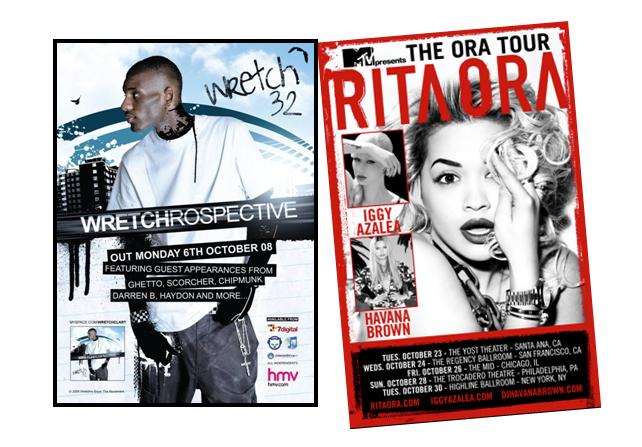
Using this logo for merchandise, advertisements all help with the promotion of the artists and for the target audience to recognize certain symbols that the artist may tend to use e.g in the 1st poster, wretch 32's logo is his name, which seems to have a hand written font, to indicate 'signature'. Also the theme the poster coveys is the street grime, due to the graffiti ink used on him and the building in the background. This also refers to his regional identity and the fact that he is looking at these building refers that his songs and music videos will be based around this.

In this advertisement of Katy Perry, there is an different picture of the one used in her album, contrasted with poster 1 and 2. However, the setting is the same, and so is the fonts, colours and costume. I think this advert is attractive because I like the idea of using a different picture but remain in the same setting along with costume and fonts. The setting in this advert is quirky, and old school (portrayed by her clothes too) which relates with our music video as it too is quirky and has that old school edge too it due to costume. I think she is trying to appeal to young girls because of the costume she is wearing and because she is holding a lollipop. These props are conventions of a girly girl. She may have wanted to focus on the younger market because they are able to promote Katy Perry due to a high uses of social networking sites and so on.I also admire that this advertisement is in landscape mode, which gives more room for the target audience to observe the setting in the background. I think when it comes to producing my own digipak, I will use the elements in Katy Perry's magazine advertisement as I believe it will establish the quirky theme we are trying create with Nabilla J.
Ancillary research: Anylsis of 3 Digipaks

Digipak for Lana Del Rey -4 Panel
When thinking about a digipak for Nabilla J, I instantly thought of Lana. The elements I admire the most about this digipak is the costume, theme, simplicity and colour scheme. The costume for Lana Del Rey reflects the scenery in the background. Her white shirt adds sophistication to her image, and her 50's inspired hairstyle helps to address her vintage soul, and overall, her brand image which is numerously reflected in her music videos, especially National Anthem. When I refer to the simplicity of the digipak, I am referring to the bold album name, name of artist, scenery and colours.
The bold fonts used compliment the scenery as well as Lana Del Rey in a mid shot. The scenery supports the 'mood' of the album, which is old school and vintage, which is strongly conveyed in the music videos. The colour scheme creates an atmosphere which is chilled, relaxing and peaceful which reflects all of her songs, which is the assumed moods a person would be when listing to her songs. However, the back cover is a bright reddy-orange, which contrasts with the two other colours to draw attention from the target audience in case they are not fully attracted to the front album cover.

Digipak for Kate Nash -4 panels
I thought It would be appropriate to analyse Kate Nash as we are using her song for our music video. I was surprised at the digipak as I was not expecting this type of theme. However, the fact that it differs from other digipaks is a highlight. The elements I like about this digipak is the front cover and the fonts used. The main thing I like about the front cover, a very wide shot of a house and the subject, Kate Nash is barley visible. Also it imitates a children story book, something that is playful and immature -in a good way. Kate Nash's red dress stands out, in order for the consumers/target audience to instantly notice her despite to strong image of the house, and colours of the blue background and green grass - which are primary colours.The childish font used, connotes the idea that the idea is based around her life, like a diary. Her music videos are down to earth and demonstrates a video diary which I think reflects the 'personal' feel to the album.

Digipak for Britney spears - 6 panels
Since I have analysed 4 panels, I will now analyse a 6 panel digipak. When I first looked at this digipak, I instantly knew that this digipak was sophisticated, exclusive and couture in terms of colours, fonts, costume and setting. In the front cover, Britney Speaks presents an expensive women, due to bronzes used for her make up and an expensive looking white shrug, which adds to this expensive image. Furthermore, on the inside of the album, there is a gold patterned chair with a shadowy atmosphere. This creates an attractive scene and highlights the riches in which Britney Spears owns. She also adds to a stereotypical image of a wealthy women , in having material things which expose her wealth. The gold fonts also add to this stereotype m and is almost like a signature, an act of a person in the public eye with wealth. The fact that this is imitated in her album establishes her status towards her fans, and will also show that successful women will have material things which reflect there wealth and so the fans will also want to live this dream. The colour schemes indicates expensiveness and exclusives.


Tuesday, 4 December 2012
Subscribe to:
Posts (Atom)