Monday, 31 December 2012
Sunday, 30 December 2012
Planning Ancillary Products: Shortlist of font and colour scheme
Here is a shortlist of my font and colour scheme design idea's:
Font:

Font:
 |
| KG Seven Sixteen Font |
 |
| Arial Font |
Our group realized that in looking at different album fonts, many artists use the same font but stylize it in a different format by making it either bold or italic- it makes people think that another font has been used when it hasn't. In accordance to this, for my digipack I will also use the same method by using the above fonts to appear in different ways.
Colour:

This is the colour scheme that our group have decided to use. We have selected one bold colour (dark purple), one soft colour (pastel mint green) and one default colour which we can use for writing purposes (white). I think its important for our album to give an indie- pop atmosphere, which is the reason why we chose those colours.
Thursday, 27 December 2012
Wednesday, 26 December 2012


Monday, 24 December 2012
Sunday, 23 December 2012


Friday, 21 December 2012
Ancillary Product Planning: Problem with Colours

Thursday, 20 December 2012

Ancillary product planning: Mock up advertisement

I like the positioning of the advertisement as it gives enough space to put reviews. This picture also portrays a relaxed down to earth Nabilla J, which will attract the target audience. I agree that the font does not fully compliment the picture, however I do like the 'out now' font and colour - its simple and bold, and compliments the advert. Furthermore, the location in the album cover is similar with the one in the advert. This is used in most of the digipak advertisements (as seen in my previous post). When I construct the real digipak advertisment, I will aim to use the same or similar photo from the album for the advertisement.
PLANNING ANCILLARY: DIGIPAK INSPIRATION

As an inspiration for my digipak, I want to base mine on Lana Del Rey's Born To Die album. I want the image on my front panel to be similar to her one (including the type of font and size).
I like how strong yet simple the image is on her front cover, and i also like colouring; it's bright but doesn't look artificial. The colour of the font also match the actual image, which I plan to do for my digipak on photoshoot.

This is the image I plan to use for my front panel, as you can see it is very similar to Lana Del Rey's image (the composition of the artist in the centre of the picture, facial expression, angle of the camera etc)
PLANNING ANCILLARY: DIGIPAK PICTURE PHOTOSHOOT

This is just a sample of images we took on our artist photoshoot :)
Wednesday, 19 December 2012
Ancillary product planning: Photo shoot inpiration

I was reading OK! Magazine when I came pass this Very.com advert of Jameela Jamil. This picture gave me the idea to let Nabilla J stand in a location which will portray a quirky theme - Paget Street is the ideal location as we did use this location for our music video, and it successful job in portraying a quirky a vintage theme. The Very.com advert also portrays this theme and I also like the way she is positioned, which says a lot about her personality and the type of genre the her collection of clothes will be. This inspired me to highlight the genre of Nabilla J's album through the use of mise -en-scene.
Tuesday, 18 December 2012
Ancillary product planning: Photo shoot fashion inspirations
I thought I wanted to keep away from Kate Nash's fashion sense which is very vintage quirky/girly girly and create Nabilla J to be seen as a tough, edgy on the outside and quirky and vintage through her songs lyrics and music video. I used this to create a balance which hasn't been created before. I wanted to keep up with the trends of this year and use that as an advantage for the target audience to show the Nabilla J keeps up with fashion trends and so does her target audience.
PLANNING ANCILLARY: MOCK UP FEEDBACK
his is some feedback from Dan, my media teacher about my mock up digipak. I plan to review what he has said and use his feedback to make my actual digipak a lot better.
Ancillary product planning: Digipak feedback
This feedback will help me produce a more sophisticated, well thought through digipak.
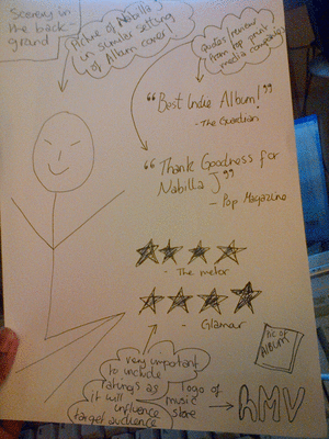
PLANNING ANCILLARY: MOCK UP


This is the mock up of my digipak. It is a 2 panel digipak with the normal digipak conventions on the first two panels, and then a small message to the fans on the inside. This is just a rough mock up of what my digipak will kind of look like, obviously the real digipak will look 100x better!!!
Monday, 17 December 2012


Thursday, 13 December 2012
PLANNING ANCILLARY: RESEARCH ON FONTS


PLANNING ANCILLARY: RESEARCH ON MAGAZINE ADVERTS

This is a Biffy Clyro magazine advert of their latest album. It has the same font and colour scheme of the actual album cover and the same font as well. It also includes upcoming tour dates and a picture of the actual CD and where you can buy it from. I like how similar the advert is to the actual album, I feel it makes it more proffessional.

The picture in this album advert is the same as the album, which I assume is a convention of a good magazine advert. It also includes upcoming tour dates and critics' reviews of the album. The colour scheme of the actual magazine advert is the same as the album, which works well.

PLANNING ANCILLARY: RESEARCH ON DIGIPAKS


Here is a three panelled digipak, by Olly Murs. I was quite surprised that as recent as this album is, that they had made a digipak for him, which just goes to show that digipaks are still important. First of all I like the colouring of this digipak, the simple blue, white, red and beige colouring work really well. They even match the artist's outfit that he is wearing on the cover. The fonts are kept the same throughout each panel, which work well with the feel of the album. There hasn't been too much editing/photoshop done to his picture which makes the digipak look that much more professional.


Here is another 3 panelled digipak. And again I was surprised to find PINK having a digipak. From this digipak, I like the contrast of the bright image on the front to the dark black and white image on the inside panel, even though they are different, it still works well and doesn't look out of place. The big bold fonts on the inside panels make the dark images stand out which works well for this digipak. On the front panel there is a mixture of colours and a stand out white and red, even at first glance, all these colours look really good together. I really like how the different images show a different side to the artist, which i think is a good thing to do for digipaks, especially for the fans.


Here is a two panelled digipak. i like how different this one is from the other two i have analysed. First of all, this one doesn't have an image of the artist/band, but have relevant symbols in each panel. I especially like the gold and burgundy red colouring on this digipak, the burgundy is dark but at the same time you have the gold making it stand out. The font in gold also makes the digipak stand out. For my own digipak, i might make it a two panelled one since I find it is much clearer and easier to perfect.
Tuesday, 11 December 2012

Ancillary planning product: Photo shoot mock up

Here are the mock up photos that we took for the mock up digipak. We chose to use the medium shot of Nabilla laughing, as I believe it added a 'down-to-earth' mood to the photo, which is a great way to connect with the target audience. The second shoot is a wide shot of Nabilla. I think this will look great as the widespread inside the digipak (this element reflects Lana Del Rey's digipak). This is because it portrays the location, which will intrigue the target audience as they love exploring new places. When we do the real photo shoot for Nabilla J, we will take pictures which create the 'down-to-earth-' mood, either her laughing and not looking at the Camera, or a non serious facial expression, to attract the target audience, and put them at ease. First impressions can make or break an artist, so therefore, by taking picture which demonstrate a laid back, humorous Nabilla J, she is more likely to gain a more fans, and more consumers. We will also take a landscape picture of Nabilla J in a quirky setting.
Ancillary planning product: Photoshop mock up of album

In today lesson, we began the digital mock up of our digipak. I found the use of Photoshop quite difficult and alot of hassle as it is new to me. However I managed to construct a rough version of the digipak. I left the background plain so that the chosen fonts is clear and to experiment with the positioning of Nabilla J. In the back cover of the album, I like the vintage border I used and I feel it fits in well with our quirky, vintage theme. I do plan on using a broad colour which will be a need contrast with the front cover of the scenery and Nabilla J.

Monday, 10 December 2012

Sunday, 9 December 2012
Ancillary planning product: CD ROM cover short list

The second CD ROM of Lana Del Rey contrasts significantly with the album cover. However, the contrast works well beautiful as it represents the outdoors, with the rose petals. The red rose petals are so elegant and are just enough to balance to striking album cover. Its good that the CD ROM is colour-less because all the attention is on the rose. The Katy Perry CD ROM is recognizably similar with the album cover, which is an important element. The colours of the CD ROM is silver, however, I think it should have been an imitation of a candy, with a spiral of red and white to make it thats little bit more fun, and attractive.
The final CD ROM of Marina and the diamonds is a metallic silver which is very striking and simple. The logo of the band is printed on the CD ROM, and I find that very clever as they did not need anymore graphics on the CD ROM. All of these CD ROM's has inspired me to reflect the album cover with the CD ROM, in a unique way. Out of all the four, I like the marina and the diamond CD ROM best as I believe it will match with our theme and will not over power the album cover. All the graphics and design will be i the album cover, so there will be no need to make the CD ROM as attractive as the album cover/
Saturday, 8 December 2012
Friday, 7 December 2012
Researching Ancillary Product: Analysis of 3 magazine advertisements

On the left is a magazine advertisement, which features 4 different artists on one page. All four of these advertisements, use track listing and some show dates for their tours alongside their album ads. Personally, I don't think its a great idea promoting a musician this way, as another ad may draw the audience away from our one. In order to draw the attention of readers, I would make my magazine ad stand out by using tons of color or have Nabilla J's face printed very large. As Nabilla J, is an indie pop artist I would make the font and the color represent the genre and appeal to our target audience.

This advertisement was in NME magazine, and unlike the one above it was given a full page. For our magazine advertisement I think it comes across really well when people use natural settings like the one on the left- so in creating our magazine ad I would also do the same. I like that this advert, shows two people walking into a black hole as it gives it a mysterious feel, almost as if once you begin to listen to this artist, listeners will be sucked into the music, and won't be able to forget it.

This advertisement instantly grabs the attention of the reader, as the yellow headline stands out immediately against the pink background. It has a cutout of the artist on the side and the tour dates presented at the bottom. Overall, I like the way they have layout the advert- I would also do the same for my advertisement with tour dates or track listing at the bottom and the artists name used in a big and bold format spread across the middle of the page. As Nabilla J is an indie pop artist, the font and color would have to represent her genre.
Thursday, 6 December 2012
Ancillary research: Photoshop practice

As this is my first attempt at Photoshop I must agree this is pretty basic and very boring. However, I will use YouTube tutorial which will help create a realistic, professional digipak and advertisement. I will refer back to previous digipak and use elements which professionalize the digipak in terms of graphics, colour scheme fonts etc. In class, we were shown an example of a poor digipak which lacked in creativity ans looked as if it was done on word document. I took this into account and I believe I can create a unique and attractive digipak.
ANCILLARY PRODUCT: PHOTOSHOP PRACTISE

This is my first practise with photoshop. To be honest I don't really like photoshop but i had a go at it and i think I did ok. In our lesson we were shown good digipak and bad digipak; I tried to use most of the conventions for a good digipak. I got the image i wanted for the background, copied it onto my 2 panel digipak, then i used the magic wand tool to get rid of the background in the picture of my artist. I added the picture of my artists to the panels; after I chose a colour and used to for the title of my digipak colour, artist name and track listing.
Overall, for a first attempt, i did well considering my mini flipping out sessions.
Subscribe to:
Posts (Atom)