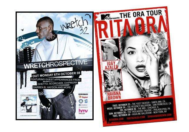
Using this logo for merchandise, advertisements all help with the promotion of the artists and for the target audience to recognize certain symbols that the artist may tend to use e.g in the 1st poster, wretch 32's logo is his name, which seems to have a hand written font, to indicate 'signature'. Also the theme the poster coveys is the street grime, due to the graffiti ink used on him and the building in the background. This also refers to his regional identity and the fact that he is looking at these building refers that his songs and music videos will be based around this.

In this advertisement of Katy Perry, there is an different picture of the one used in her album, contrasted with poster 1 and 2. However, the setting is the same, and so is the fonts, colours and costume. I think this advert is attractive because I like the idea of using a different picture but remain in the same setting along with costume and fonts. The setting in this advert is quirky, and old school (portrayed by her clothes too) which relates with our music video as it too is quirky and has that old school edge too it due to costume. I think she is trying to appeal to young girls because of the costume she is wearing and because she is holding a lollipop. These props are conventions of a girly girl. She may have wanted to focus on the younger market because they are able to promote Katy Perry due to a high uses of social networking sites and so on.I also admire that this advertisement is in landscape mode, which gives more room for the target audience to observe the setting in the background. I think when it comes to producing my own digipak, I will use the elements in Katy Perry's magazine advertisement as I believe it will establish the quirky theme we are trying create with Nabilla J.
No comments:
Post a Comment